
Student Scholarship
2023-24
From Overload to Efficiency: The Role of Minimal Layouts in UX Optimization (O)
Presenter: Olivia Felis
Faculty Project Advisor: Haelim Allen
Researchers are consistently expressing how decision fatigue and choice overload negatively affects the human brain and lessens the ability to perform tasks quickly. In a fast- paced world, the quicker a user can complete an online task using a website or app, the more appeal they have to the UX, or User Experience. To achieve this, designers have studied the paradox of choice, created by Barry Schwartz, to understand how a plethora of choices overburdens a user. There are certain instances in which maximal web design is appropriate to use, but the most successful businesses use a minimal layout. They have achieved a delicate balance of efficient, but limited choices, while presenting the effect of full opportunities. Examining the user interface (UI) and user experience (UX) of the most successful web and app designs will expose the significance of minimal layout design.
The Beauty of the Everyday (O)
Presenter: Anna-Asher Baine
Faculty Project Advisor: Christopher Nadaskay
Throughout art history, a common theme in subject matter has been everyday scenes, often in places that the artist felt familiarity. These pieces speak to the viewer in a way that others do not. Van Gogh's paintings of Arles, France clearly convey the delight that he took in the scenes that surrounded him. Monet's paintings of his beloved garden demonstrate the artist's affection for that carefully cultivated place. Whenever an artist paints a scene that they know and love, they are inviting the viewer to join them in a memory. With this series, "The Beauty of the Everyday" I am hoping to invite the viewer to see the beauty of places that the Lord has used to supply me with many wonderful memories and to hopefully give the viewer a new scene to look back on with joy.
Impressions of Israel: Capturing the Feel of a Place Through Painting (O)
Presenter: Emily Gray
Faculty Project Advisor: Christopher Nadaskay
This semester, I have explored expressionistic landscape painting. My work has focused on oil paintings of places I visited in Israel this past summer. Expanding on initial sketches and paintings I did from life on-site, I created a larger-scale, more permanent body of work. My goal has been to capture not only the landscape itself as a photograph would, but also to use the technical aspects of the craft of painting to express the emotional and spiritual significance of each place as I remember it. My work demonstrates experimentation and a progression toward a manner of working that I feel best expresses my memories of Israel.
The Sincerity of Ephemerality (O)
Presenter: Austria Eckenrode
Faculty Project Advisor: Christopher Nadaskay
Portraiture dates back at least 5000 years ago. At that time, they were produced on Egyptian sarcophagi with the motivation to exalt those of the upper class or to commemorate the dead. The production of individual portraits has evolved since then, allowing for a great deal of freedom today in the arts. Now, artists explore portraiture as a means of expression of personal thoughts and ideas. The body of artwork I have crafted aims to capture the beauty of ephemeral moments and their sincerity. Observation of the people around us enables us to catch and retain those moments and reflect upon their significance. In order to achieve a more permanent record of those moments, candid photographs have been carefully chosen and rendered onto canvas. Each painting within the series aims to follow an overall cohesive style with a focus on color and value structure. Through these paintings, I am trying to elicit a deeper connection to themes of the value of a memory and the important role that painting can play in furthering our appreciation of beauty in others.
Spotlighting the Undervalued World of Prop Design: Examining the influence pertaining to Graphic Design History (O)
Presenter: Abby Kraus
Faculty Project Advisor: Haelim Allen
Films are an immersive experience that allows viewers to escape into an enchanting world of fictional reality. Seldom recognized, graphic design is a main contributor to the creation of these realities, specifically through the design of graphic props. Graphic props are designed elements such as signage, letters, packaging, posters, and other items that briefly appear, usually in the background of films. These props aid the production of films by visually authenticating, for the viewer, the believability of the cinematic world. The creation of a convincing prop requires extensive research in design history which informs prop design. The designer must reimagine past designs to establish the credibility of the prop and environment of that era. The iconic props evident in such films as Bridge of Spies, Willy Wonka & the Chocolate Factory, and Harry Potter are attributed to historical design movements. Unheralded as it may be, the impact of graphic design on the film industry is revealed through the examination of the seldom acknowledged world of graphic design props.
Digital Marketing in the Current Age on Brand Identity (O)
Presenter: Adelaide Thompson
Faculty Project Advisor: Haelim Allen
The age of social media has greatly affected how companies approach their online identities. Social media users look to be entertained more than marketed to — hence a change in many brands' online identities. Some of the more successful businesses who have made this switch are Wendy's, Duolingo, Hootsuite, and Washington Post. These diverse businesses prove to be excellent examples of how entertainment, trends, slang, informality, and less polished designs can be utilized to promote more user engagement. By altering their online identity to be less formal and corporate minded, they are better able to capture the attention of the younger generation.
Drawing Assessments: The Importance of Art Therapy (O)
Presenter: Grace Rodriguez
Faculty Project Advisor: Haelim Allen
Art therapy is used to assess and implement both two- dimensional and three-dimensional art mediums in order to help evaluate a client. The two-dimensional assessments implemented when starting the counseling process include the Draw-a-Person Test, the House-Tree-Person Test, and the Kinetic Family Drawing Test. These assessments will assess a client and qualities about them such as past and current experiences, background, and character traits. The Draw-a-Person Test uses the drawing medium to reflect the patient's self-concept by drawing a figure along with answering a series of carefully designed questions. The Kinetic Family Drawing Test also reflects the client's self-concept, but in a family unit. It also uncovers the nuclear self and internalized feelings, along with other aspects. The House-Tree-Person Test on the other hand focuses more on the conscious and unconscious information about clients, telling the therapist about the client's personality and how they may interact with people and the environment. These art therapy assessments help the client progress through counseling; however, it is important to start the counseling process at an early age in order to help develop healthy habits and tools through everyday life.
Ryan, Apeach, Ned and Friends — How Cartoon Caricatures helped a Corporation Stay on Top (O)
Presenter: Alexandra Brown
Faculty Project Advisor: Haelim Allen
Kakao is a corporate entity that has ties to many different businesses and services such as taxi drivers, banking, and most popularly, instant messaging in South Korea. As opposed to using other social media apps such as Snapchat or Instagram, 98.2% of Koreans use the popular messaging app KakaoTalk for all communication purposes, surpassing any other messaging platform used in South Korea. There are many factors that led to their success as the biggest messaging app in the country, but perhaps the biggest asset that draws in customers are their animated characters. A lion without a mane, a peach, a bad-tempered duck, and many more cartoon characters make up the faces of Kakao's entire franchise. Ryan the lion and his friends quickly became extremely popular due to their distinct personalities which encouraged users to connect with certain characters, and have helped to pave the way for Kakao to become one of the biggest companies in South Korea.
The Negligence of Effective Design (O)
Presenter: Noah Windham Faculty Project Advisor: Haelim Allen
From the logo of a startup business to the website for multimillion-dollar companies, design as visual communication is needed in every area of brand identity. Yet as the demand for design grows, so does the demand for a consumer driven approach and the introduction of cheap substitutes for good design. Attempts to streamline design have offered solutions to clients' design needs yet neglect key elements of effective design such as brand identity and originality. As the line between design and consumerism blurs and as what defines a good designer becomes more ambiguous, the need for educated and skilled designers is greater than ever.
2022-23
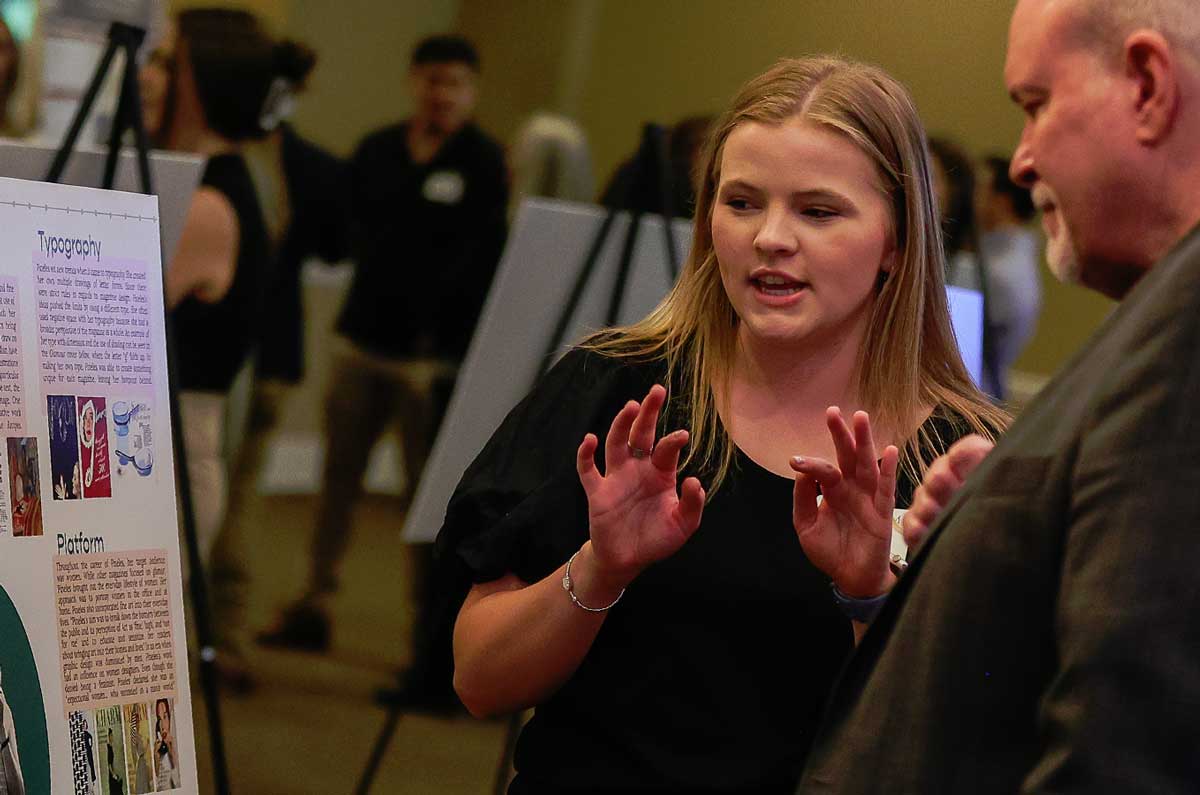
Cipe Pineles: Making Magazines into an Art
Presenter: Olivia Duke
Faculty Project Advisor: Haelim Allen
As a twentieth-century pioneer for women in graphic design, Cipe Pineles transformed magazines and editorial works into fine art. As an art director for magazines such as Glamour and Seventeen, Pineles used handwritten type, illustrations, color, and photography as her platform to publish editorial design in a fresh new way. Since photography in the mid- twentieth century was overly used in other publications, Pineles used her fine art skills to bring a unique perspective to her magazines. Her hand-drawn type and illustrations captured the eye of readers and brought a level of intimacy to her design work. With motivation to expose her readers to modern art, she insisted as an art director that her layout designs were of the quality that would be displayed in an art gallery. Since Pineles' target audience was mainly women, she visualized in publications what roles women could pursue which differed from traditional household duties. Thanks to her editorial and design work approach, Cipe Pineles turned magazines into an art form, not just a news source.
Iconic Packaging: The Apple iPhone
Presenter: Madison Gross
Faculty Project Advisor: Haelim Allen
This research aims to define how Apple has evoked a quintessential packaging experience to promote the iPhone. Inventors Stephen Wozniak and Steve Jobs constructed the company Apple in 1976. Over time, every aspect of their packaging has been tested and retested to institute a sensory experience. The iPhone first generation's packaging was the foundation of the modern-day iPhone fourteen. The evolution of the design has transformed the way that consumers perceive the company. From the sleek design to embossed images, Apple gives strict attention to detail to execute luxurious packages that are distinguishable by consumers. With all of their product's packaging, there is a polished surface that is accompanied by the most well thought out design. Apple products are among the most sought-after smart devices of 2023. Every year, Apple strives to innovate its packaging design from prior years.
Prints and Posters: The Ukiyo-e Influence on Alphonse Mucha's Aesthetic
Presenter: Amy Kuhl
Faculty Project Advisor: Haelim Allen
Ukiyo-e, a popular form of Japanese woodblock prints, gained widespread recognition in Europe during the late 19th century. This was due to the forced opening of Japan that occurred in 1854. The opening allowed free trade and the influence of Japanese culture on the West. This influence is evident in the work of many graphic artists such as Eugène Grasset or Jules Chéret; even so, the influence on graphic artists is most clearly seen in the work of Alphonse Mucha. Common traits used in Ukiyo-e prints become apparent when analyzing Mucha's art: the use of flat colors, bold outlines, and asymmetrical compositions. Mucha adapted these techniques to match his own style, which resulted in a unique blend of Ukiyo-e influence and Art Nouveau style. The popularity of Mucha's work, particularly his posters and advertisements, resonated with the public because of this unique blend. By examining the specific techniques that Alphonse Mucha developed from Ukiyo-e and the ways in which he adapted them to suit his own aesthetic, this research provides insight into the key influence on Mucha's work: Ukiyo-e prints.
What's the Point: An Analysis of Dots
Presenter: Daniel Howe
Faculty Project Advisor: Haelim Allen
In printing, nothing has quite the same power and influence as the dot. In the same way that pixels make up all modern digital images, thousands of tiny circles, or dots, make up most modern printed images. These dots often go unnoticed and easily confused, but when magnified, it is clear to see that there are many different styles of dots. The main four misconstrued dot styles are: Ben Day dots, halftone screens, Roy Lichtenstein dots, and Kirby dots. Benjamin Day was a printer and inventor who created his Ben Day dots for the purpose of shading printed drawings in newspapers, which went on to have their own life in comic book art. Roy Lichtenstein, an American Pop Art painter, used an altered version of Ben Day dots in his paintings to great effect as a graphic element in his work. Jack Kirby was a comic artist who used his dots to convey energy. While Ben Day dots were made for the printing process, halftone screens were created for the photo taking process. Halftone screens aimed to break images up into less expensive versions for lower quality printers. Lichtenstein dots were used to emulate the comic style of shading, while Kirby dots were used to show energy on the comic page. Just as they did in Spider-Man: Into the Spider-verse, these dots will start to show up in more popular films and culture, so it is important to know about them now. This research will analyze each dot to find its origins and what makes each one different from other kinds of dots in order to be able to identify them as they become more prevalent in popular culture.
Our Footprint: A Study on Sustainable Packaging
Presenter: Makenna David
Faculty Project Advisor: Haelim Allen
The packaging industry has made progressive efforts to engineer and design structures and materials that have a cleaner impact on the environment, from paper-based shipping materials to reusable food containers. Modern packaging was introduced in the early nineteenth century and evolved to recognizable packaging such as the iconic Coca-Cola bottle. This research will analyze the history of package design and wherein the ideas toward sustainability were introduced, as well as current efforts. Brands in all areas of consumer life such as Puma, Pangea, and Alter Eco have drastically decreased the amount of single use packaging or have transitioned to utilizing only recyclable packaging. Consequently, global recycling efforts have increased with the improvements made in packaging. With the efforts on behalf of producers and designers, environmental progress towards waste reduction can continue expeditiously because of the developments of sustainable packaging within both materials and design.
Okay Google, How is Brand Identity Created?
Presenter: Cayli Lambert
Faculty Project Advisor: Haelim Allen
Brand identity is what a business portrays to the world to be recognized by consumers. For a business to become more prominent against competitors, brand identity must be approached with attention to its personality, physical features, and value. Google is a highly recognizable brand across the globe, with its youthful personality and its value in making information accessible.. This research will delve into the details of Google's brand identity, including how the company chose to respond to technological advancements. Google is able to achieve these ideals by remaining a single brand house and adding brand extensions, which are marketing strategies that allow a company to produce multiple products under one identity. As of February 2023, Google holds 93.37% of market shares over other search engine companies. Yahoo is one such company that lacks in its attention for brand identity. Thus, this paper will contrast Google's success with Yahoo's failure. Even as Google exists as artificial intelligence, consumer electronics, and an Internet search engine, Google's brand identity remains one of the strongest.
The Evolution of Christmas Cards
Presenter: Cassalyn Callahan
Faculty Project Advisor: Haelim Allen
This research project examines the history of the Christmas card from its origins in the mid-19th Century to the variety of types and features of Christmas cards present in today's industry. The predominant types of Christmas cards specified in this paper are the commercial card, the homemade card, the official card, the E-card, and the artisan card. Each classification of the Christmas card is determined by the distinct design features, the purpose, and the production process of the card. These types of cards formed over the span of three eras: the Victorian era, the American era, and the Smart Technology era. The origins of the popular types of cards will be discussed in order of when they emerged throughout the three eras. Following the origins of each type of Christmas card, the evolution in the popularity, the physical features, and the usage of the type of card will be examined. The research found from studying these evolving trends will inform the possible future of the Christmas card, including prospective trends and whether the tradition of sending physical Christmas cards will survive the progression of smart technology.
Red Bull Gives You Wings: How Red Bull's Marketing Strategy Helped Them Fly High
Presenter: Sylvana Kempka
Faculty Project Advisor: Haelim Allen
Red Bull is an internationally recognized brand that has taken the energy drink industry by storm. The brand's success in the energy drink market can be attributed to its consistent branding, targeted marketing strategies, and effective use of graphic design to create a unique and memorable brand identity. What makes Red Bull's targeted marketing strategy so unique is that instead of focusing on advertising their products, they create events and experiences for their customers. Red Bull's design is strongly recognizable by the two red bulls charging towards one another in front of a yellow sun. The Red Bull logo is a perfect representation of the brand's name, and it communicates the values of the brand such as energy, strength, dynamic, and rebellion. Red Bull is known for the use of a red and blue color scheme and for their slogan, "Red Bull Gives You Wings." They create unique animated TV commercials in which they advertise that slogan. Red Bull uses social media platforms and popular streaming services to reach and engage their target audience. The company markets its products to athletes and extreme sports enthusiasts, young people, and adrenaline junkies who best fit Red Bull's characteristics and values. This research paper analyzes the company's logo design, packaging design, color choices, and unique marketing strategies, including a comparison with its closest competitor in the energy drink market. Red Bull's success as an energy drink company is a good example of how strong branding and marketing can lead to significant company growth and market dominance.
Seeking an Audience Outside the Gallery
Presenter: Kendra Duffey
Faculty Project Advisor: Christopher Nadaskay
When I was a kid, I had this dream to paint for a living. When elementary schools would ask me to draw what I wanted to be when I grew up, I typically drew myself painting in front of an easel. As I practice painting in school, I find myself drawn to painting, but not for galleries. Instead, I have been seeking an audience outside of the galleries. Mural painting and illustration have been my focus in painting during my senior year. My past work, that I thought would lead me to gallery work, only sharpened my skills for a new focus and direction for my art. The colors, brushwork, art principles, and strengthening my creativity learned through my last works help me in my current mural and illustration jobs.
Speed of Love
Presenter: Joy Robbins
Faculty Project Advisor: Christopher Nadaskay
Faster than can ever be fathomed, light speeds throughout the universe and graces every corner with the love of God at 299,792,458 m/s. God in his divine kindness has gifted the ability to enjoy these powerful and awe- inspiring hues to humanity for our enjoyment. This project is a celebration of the sensory experience of color, as well as the God who lovingly created us.
Living in the Unreal Illustrations
Presenter: Cayli Lambert
Faculty Project Advisor: Christopher Nadaskay
Living in the Unreal is a body of illustrative work that utilizes pen and ink wash on drawing paper. Creative imagination is the foundation of each illustration to summon landscapes and architecture. They are created for specific spaces and with an individual visual vocabulary. The first illustration, Floating Islands, was the first illustration that set the tone for what I wanted to do with this series. The act of simply creating, embracing the medium I most enjoy, and tearing down boundaries that keep me from expressing my imagination are the main implications that I learned while drawing.
Incorporating Autism Acceptance into Children's Literature
Presenter: Anna Meadows
Faculty Project Advisor: Christopher Nadaskay
Consultation and collaboration with a Pre-K special education teacher encouraged the production of a children's book created specifically to introduce special needs students to other children. The book, Xander's Zoo, is based on a nonverbal autistic child named Xander who communicates acceptance and inclusiveness through the love of his animals. As a focus for my ART 218 class, I was tasked to research and create twelve illustrations. I used my own illustration style for each character and decided on stylistic choices throughout the entire book. Autism acceptance plays a significant role in the book hoping to teach children to be accepting of others despite their differences.
Guess Who: Designing Characters
Presenter: Daniel Howe
Faculty Project Advisor: Christopher Nadaskay
Character design is a very important facet of game design and is based on simplifying shapes, creating icons, and developing a personality through image alone. Successful character design must communicate on a functional, aesthetic and visually communicative level. The aesthetic qualities of a character must be pleasing to the viewer while maintaining visual cohesion with the overall work. The functional characteristics of a character must also work in concert with its design and communicate to the player the abilities and actions that are available to them. This presentation is a survey of character design, examining those aspects and researching the use of shape, icon and personality.
The Role of Interactive Ads in the Evolution of Advertising
Presenter: Vanessa Fillmore
Faculty Project Advisor: Haelim Allen
Advertisement has evolved from printed ads and television commercials to a new marketing approach. Interactive marketing has infiltrated business and product advertising. Daily internet and social media usage is rapidly increasing; thus, advertising is difficult for consumers to avoid. Instead of changing the television channel or turning the newspaper page to avoid ads, the interactive elements such as the "skip ad" or "buy now" buttons, QR codes, or advertisements where consumers can physically see themselves using a product, have made it nearly impossible for consumers to avoid ads. Traditional advertising relies on physical media to reach its target audience and utilizes a passive approach, whereas the interaction now needed to escape an ad causes the consumer engagement. Interactive advertising relies on the consumers' constant interaction with advertisements to drive sales. This research will examine two modern methods to consumer interaction and marketing through the advertising approaches taken by companies like Reebok, Spotify, and Volkswagen, and the social media platform, Instagram, as a streamlined marketing tool from businesses to consumers.
A Woman of Virtue: Sofonisba Anguissola's The Game of Chess
Presenter: Joy Robbins
Faculty Project Advisor: Haelim Allen
Giorgio Vasari, in his book The Lives of the Most Excellent Painters, Sculptors, and Architects, details great artists such as Leonardo da Vinci and Michelangelo. Included is a small section presenting Sofonisba Anguissola at the end of Properzia de' Rossi's vita. Anguissola's work was praised not only by Vasari, but many others including Philip II, Michelangelo, and Queen Elizabeth of Valois. Vasari was so impressed after meeting Anguissola and her family, that he included her in his second edition of "Lives". What was it that Vasari found so fascinating about Anguissola, particularly in a time when women artists were not celebrated? Vasari, while doubtless amazed by her talent, must have been equally impressed by her virtue. Anguissola's humanist father sent her for schooling as a painter, not so that she would have a career in painting, but that she would be seen as a woman of great virtue through her educational achievement. Many of her paintings, which were self- portraits and portraits of other women, emphasize this focus on virtue, a core theme in her work. Anguissola chose to sign her name, "Sophonisba Angusola virgo seipsam fecit 1554" (translated "The virgin Sofonisba Anguissola made this herself in 1554") on her painting to emphasize this commitment to virtue.1 Arguably, Anguissola's most well-known work, The Game of Chess, features her sisters as the subject matter. This painting presents her sisters as intelligent and highly skilled strategists in the game of chess. Anguissola also clearly possessed great intelligence and strategical skills to have succeeded in her career as a woman in this time period. Anguissola's life and work presents herself and her sisters as intelligent women of virtue.
A Celebration of Joy in Portraiture
Presenter: Leah Steed
Faculty Project Advisor: Haelim Allen
Historically in the hierarchy of painting, portraiture was considered the second highest subject matter after historical painting. This is largely because of the understanding of the complexity of human anatomy and the desire for remembrance. As Christians we affirm this importance, understanding that every human being is an image-bearer of God, made in His likeness and created with purpose. Portraits capture this significance. This semester, through color and gestural expression, I have sought to celebrate the lives of individuals who are significant to me. This series seeks to capture the beauty and individualism of these people, investigating how their physical appearance conveys who they are. I wanted to capture the joy these people have brought to my life as well as call attention to their worth as image-bearers of God.
2021-22
Color as Candy (O)
Presenter: Kendra Duffey Faculty Project Advisor: Christopher Nadaskay
No color. Imagine a world without color, yet the forms of objects are still visible. Though there are some cases where people are completely color blind, most people can see color in some way. If you see color in any way, can you imagine life without it? "Color As Candy" celebrates color by comparing it to candy in paintings made in oil and acrylic. Color is an addition to vision, as candy is an extra part of a meal. I'm not saying that color is not nutritious in a visual sense. Color is important, but what if God created sight without color? Seeing hues in the world around us is many times taken for granted. Come celebrate and be reintroduced to colors that are found all around in the "Color as Candy" painting series.
National Parks and National Forests (O)
Presenter: Joy Robbins
Faculty Project Advisor: Christopher Nadaskay
Our National Parks and National Forests protect many wonderful areas of God's creation. These protected areas provide the space needed for individuals to gain valuable experiences in nature and also provide natural “classrooms” and “studios” in which the artist can learn and work. These parks and forests allow the artist or visitors to gain a deep respect for God's creation of nature and the world around us. The National Parks and Forests allow the opportunity for curiosity and wonder for those who visit them. This curiosity and wonder is what I try to capture in my paintings. My watercolor paintings depict several of the various National Parks and National Forests. My paintings come from both an appreciation and desire to visit the National Parks and National Forests and to display the glory and wonder of God's creation.
Television Commercials to Social Media Ads: The Evolution of Advertising (O)
Presenter: Grayce Lillpop
Faculty Project Advisor: Haelim Allen
The evolution of visual advertising throughout history has significantly altered the way we perceive media and purchase goods today. With the invention of the television in 1929, graphic marketing material that consisted of two-dimensional printed advertisements was now made available with sounds, sights, and motion, thus increasing entertainment value and conversion rates exponentially. Early television commercials aimed to make goods readily accessible to those wanting a product, and the same principle has spanned generations into the current digital world. However, modern means of advertising have shifted to cater to this generation's specific consumer behaviors and preferences. To gain a better understanding of this trend is to identify where early television advertising began, acknowledge its purpose, analyze its impact, as well as observe how advertising material is currently being created. This research demonstrates how the manner in which media is encountered today has evolved from exclusively being available within a television screen to being accessible at every fingertip through the power of social media advertising.
Painting on Walls: Modern Public Murals as Art (O)
Presenter: Callie Wright Faculty Project Advisor: Haelim Allen
Art museums and traditional galleries are considered establishments of high culture and class, full of fine artworks gracing their walls and pedestals. One form of art that lives outside the gallery, however, is the public mural. Murals occupy particular public spaces and are installed directly on the interior and exterior of buildings, rather than canvases or smaller substrates. With a long history in the art world and social movements, today, many large-scale murals become local landmarks. Cities, including Jackson, are promoting this form of public art as an avenue for urban beautification and development. While this public art form may be tangentially related to the fine art world, it has unique potential to engage a different kind of artist, audience, and space. This survey will examine the development of public wall murals in the contemporary art world and discuss the unique purposes, considerations, and community this medium creates.
Revolutionizing the Title Sequence in Cinema (P)
Presenter: Chloe Thomas
Faculty Project Advisor: Haelim Allen
This research delves into the history of the film title sequence and discusses how designers and filmmakers like Saul Bass and Maurice Binder revolutionized the cinematic world with motion graphics. Title sequences were once motionless cards that solely showcased the production company's trademark, yet through time have presently become intricate and meaningful additions that, as Bass has stated, “prime the underlying core of the film's story.” It was not until Bass and Binder began their successful careers in the film industry that cinema saw a shift in title sequences into more of what is seen today with moving parts, invigorating music and details that give clues to the plot. Prior to their work in the late 1950s, title sequences had not progressed significantly in over twenty years. Bass and Binder's styles, techniques, and film direction have resulted in some of the most recognizable sequences and scenes to date, such as the famed gun-barrel sequence for the James Bond film, Dr. No. Both designers saw an opportunity for innovation in the industry and were able to use their imaginations, alongside motion graphics, to change the course of titles in cinematic films.
Ansel Adams: The Father of Dodge and Burn (P)
Presenter: Ella Wheeler
Faculty Project Advisor: Haelim Allen
Ansel Adams, a pioneer in black and white photography, grew up socially isolated from others in his youth. He spent most of his youth documenting nature and landscapes through the lens of his Kodak camera. Over the years, he developed and refined methods of controlling lighting and contrast in his printed photos. He began with his ten tonal zone system of exposure and development, then developed straight photography in which the final image had no alteration from the moment it was taken to the final print. Finally, Adams created one of his most influential methods to date: the dodge and burn method of photo processing. Through his manipulation of light exposure during the development process, he was able to create his visions of his artwork. This was a major milestone in the realm of photo editing, which is still used today in the dark room and has now been digitized in contemporary photography. One of the most common features in Photoshop, is the Dodge and Burn tool. Due to Ansel Adams' discoveries and innovations, photographers worldwide have much more creative freedom in the editing process, revealing their artistic visions of the world.
Wabi Sabi: Philosophical Design (P)
Presenter: Ashley Perkins
Faculty Project Advisor: Haelim Allen
Wabi Sabi is a Japanese philosophy which embraces the beauty of imperfection. With roots in ceramics, Buddhism, and Taoism practices, it values simplicity, humility, and nature. According to Axel Vervoordt, a notable interior designer, ceramicist, and fine artist, Wabi Sabi finds elegance, perpetuity, and honor in otherwise humble and minimal materials. Using water, wood, metal, and natural light as his palette to create a harmonious living space, Vervoordt's interior designs are the physical manifestations of what he believes Wabi Sabi to be. He asserts that his personal definition of Wabi Sabi is the beauty in objects that are pure, natural, humble, and reserved. He also suggests it is timeless and creates a heightened physical and spiritual awareness in a viewer. Discerning what Wabi Sabi exactly is and whether or not it should be implemented in interior design is an arduous task; by analyzing Vervoordt's designs, an informed decision on this philosophical design can be made.
Jenny Saville Incarnate (O)
Presenter: Sara Nevius
Faculty Project Advisor: Haelim Allen
Jenny Saville is a contemporary British painter who studied at the Glasgow School of Art from 1988 to 1992. She earned her recognition in the exhibition Young British Artists III at London's Saatchi Gallery in 1994. This research explores Jenny Saville's figurative paintings in which she addresses cultural beauty standards of women. Her works, Plan and Propped, react and challenge these standards by depicting tones with a colorful palette, manipulating scale and proportion, along with atypical perspectives of the figure. The pieces articulate flesh through color and brushwork and challenge the historical artistic traditions of the female figure. Saville questions western beauty standards as they may endorse unattainable body ideals through diet culture and plastic surgery. Saville's Plan addresses these existing standards by including surgical markings and exaggerating the scale of the figure. In Propped, Saville confronts these ideal standards through amplifying the figure, in addition to painting the words of feminist philosopher Luce Irigaray. In addition, Saville manipulates paint in such a way to portray the figure beyond the traditional canon of figurative work while maintaining aesthetic considerations. Saville's two works counter traditions of female representations as Saville represents both the model and the artist.
Ipseity (O)
Presenter: Sara Nevius
Faculty Project Advisor: Christopher Nadaskay
This presentation explores a body of drawings and paintings titled Ipseity meaning individual identity. Tension and division have infiltrated many aspects of society between religious groups, political affiliations, racial groups, and gender orientations. As a response to this division, the works in Ipseity explore the individual's identity and cultivate a relationship between the viewer and the subject to learn, find beauty and human connection in the diversity of perspectives. Specifically, the paintings Gwyn and Gwyn II explore the subject's identity of womanhood and femininity through color, composition, and positioning. In addition, the paintings of this body of work are produced using the Zorn palette, also known as the “limited palette” comprised of four basic colors: white, black, vermilion, and yellow ochre.
The Evolution of The Wedding Invitation (O)
Presenter: Avery Lopez
Faculty Project Advisor: Haelim Allen
This research aims to examine and explain the evolution and processes which brought about the wedding invitation. Before Gutenberg's printing press was invented in 1447, the wedding invitation began as a verbal exclamation by the town crier. Over time, the wedding invitation has developed into a commercialized phenomenon. This portion of wedding planning has created an aspect of societal expectation for couples. The immense diversity is displayed in the: formatting, styles, content, and embellishments of the invitation itself. The invitation's extravagance is seen as an exhibit of the affluence of a bride's family.
Faces of Jackson: Portraiture as a Dignifying Act (O)
Presenter: Callie Wright
Faculty Project Advisor: Christopher Nadaskay
The Christian faith and the social work profession both speak to a specific understanding of human dignity and the calls to see, serve, and love one's neighbors. This body of work seeks to use visual art as a unique medium for communicating these ideas. This series of portraits shows local neighbors in Jackson — those who have recently been experiencing homelessness in our community. The works use the tradition of portraiture to encourage the subjects to see the beauty in themselves and encourages the viewer to see them as a neighbor. For the artist, creating these portraits becomes a meditation on the subjects as Image- bearers, giving these neighbors the time and attention that dignity merits. Displaying their likenesses through works of visual art affirms that the subjects have lives and stories, and as Image bearers, they are worth seeing.
Art Therapy for Hospitalized Children (O)
Presenter: Laura Rose Gray
Faculty Project Advisor: Haelim Allen
This essay will explore how art therapy can help hospitalized children process their emotions and gain a sense of control. Young children have trouble expressing their suffering in words. They show us how they feel through their behavior. Art therapy for children in a hospital setting can give them a space where they can feel more comfortable while in the hospital and a chance to process through their emotions about being there. The duration of the child's stay in the hospital and purpose for the stay require the therapist to use individualized techniques with each patient. Art therapy comes equipped with numerous opportunities to help children through the medium that is used during therapy and the way it is used. During this process a therapist can identify the struggles that a child is having. Ultimately, the therapist can help the hospitalized children start to verbalize and process through those emotions.
American Raku (O)
Presenter: Sara Beth Zeiser
Faculty Project Advisor: Haelim Allen
Raku is a ceramic firing technique that was founded in the 16th century Japan. It was created as a part of a traditional Japanese aesthetic and became very popular in the late 1500s and has not lost its popularity since. Its history intertwines with the Japanese tea ceremony and wabi sabi aesthetic. A British ceramicist, Bernard Leach, visited Japan in 1908 and stumbled upon raku accidentally. He was infatuated with raku and brought it back to Britain which created a raku revolution in the west. Artists picked up the technique quickly; Paul Soldner, an American ceramicist, brought raku to the United States in the early 1950s. As raku's popularity grew among American artists, its historical roots, that tied into the ancient Japanese aesthetic, were lost and only certain ceramic technique remained. In the United States, artists picked up the technique quickly and were captivated by the beautiful surface texture it created. It is a low-firing technique that causes the clay to have a unique surface texture that is different from other firing techniques. Raku is a technique that pulls the pottery out of the kiln at its hottest point and the cold shock from the atmosphere causes the pottery to cool extremely quickly, which causes the beautiful surface. This research is an overview of the journey of raku from ancient Japan to modern America, along with people who contributed to spreading the technique around the world.